Monthly Archives: February 2015

Game Development Blog 3.

This week in our game development course things have been a little bit contradictory.

After the alpha was completed and our group was allowed to stay together, we ended up a little bit on a cloud and as such I am fearfull of the fact that we might have fallen a bit behind again. At the moment we are in a place that is still not so bad, but I am a little bit uneasy about the future 4 weeks. Anyways, onwards to my work this week.

This week what I have been doing is working on the loose condition splashs screen. Essentially the screen you see when you are shot dead in the game.

Since fancy mansion is not your house, and you are stealing from Otto von Fancy, the owner of the mansion, he will shoot you if he finds you.

Our place-holder art was a black-screen filled with read blood, the text “Dead” centered in the middle, and the thiefs legs sticking in from the right edge of the image (as seen below). This represented well the feel of the picture we wanted, but was poor in execution, as it should be, and didn’t really give you a view of what had killed you, what you had seen last in your life as the thief.

Loose screen
I expressed my dislike for the picture to our two art guys and they took what I had said to heart and started over with it, still in mind it was only placeholder so far. I was at home when the change took place, and as my drop-box resynced with the new picture I took a look at it and liked it far better. Otto stands over the thief with his shotgun ready (as seen below). Though this one was too meek in comparison to the sea of blood that could be seen in the first picture. Also, Otto was seen in his in-game pixel-form.

Loose screen2
I liked the idea though, and so took it upon myself to iterate on the screen, adding a bit more detail, high-lights, shadow and smoke to the otherwise quite flat picture. I made his wrinkles deep-set, his baggy eyes heavy and his face splattered with red blood to make him feel more intimidating. What I ended up with was loved by our team and in the end is something I can keep iterating upon to make it something that will be in the final product of our game.

Loose screen2_Iteration

Game Development Blog 2.

This week I will be talking about the level design we did for the ALPHA playtest.

This week, the 16/2- 2015, we had a playtest for our classmates in order to recieve feedback on our games, as well as what could be done with them, to see things from another perspective. As we did not have a proper level in the game yet, but had one design finished, we decided to implement that design in the engine previously than intended.

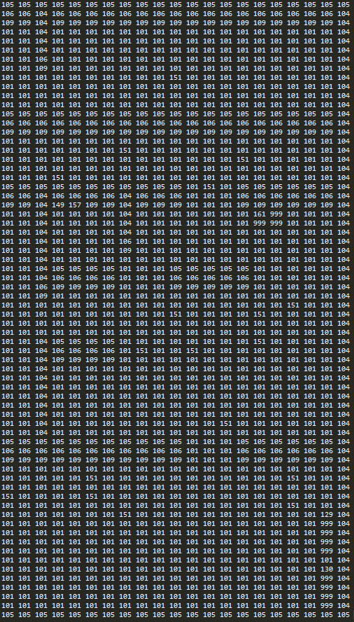
To do this we had to use our Lead-Codes .txt-file in order to construct the map in the game. What you get then, is a column-and-row system that represents the entire map in tile-name style.

Every number is a representation of a tile. For Example: 105 is a horizontal wall-tile, 104 is a vertical wall-tile and 106/109 are the upper and lower texturized wall tiles for collision and looks.

Numbers

My personal feelings for this way of creating the map notwithstanding, its quite effective when you have all the items implemented and the map already laid out in the file. However, as we were short on time in order to finish the level before the play-test, I had choose part of the map for the playtest and implement the rest of it at a later date. This decision was based on the fact that a 1920×1080 pixel resolution screen cannot compress the numbers on screen small enough to fit the entire level logically. What you end up with is a hodge-podge of numbers that ceases to carry any meaning to you logically. We realised we will have to finish the level in either 3 stages, or use a 2560×1440 resolution screen or bigger to finish it.

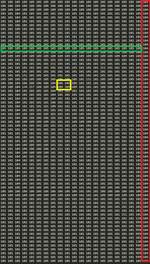
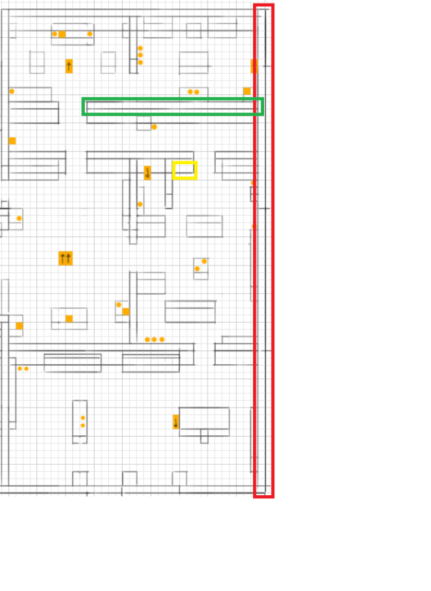
Looking at our whole level, and comparing it to the .txt-file, you can see in the colored sections that they match up.

NumbersColor

MapColors

So, due to the technical limitations to the .txt-tile we could only fit 1/3 of the entire level into the playtest.
We wanted to give the player a chance to look at our current tile-textures and finished artifacts to look at, so I threw them our randomly on the map and what we ended up with was something that looked complete level-wise, yet unfinished design-wise. There was no clear path, and no obstacles or decorative items in the level, just empty open rooms. We received inconclusive criticism for this and as such is something we will have to expand upon before we go into BETA.

Game Development Log 1.

This post will be about a specific artifact in our game, Fancy Mansion.

Specifically, the design-choices and drawing of the moneybag, used as an item to be picked up to increase the players overall score in the game.

Fancy Mansion is a game about picking things up and increasing your own monetary value by stealing items. In order to represent a valuable items, first of all we chose iconic objects to symbolize this. The first object, the most basic design, was a bag of money. It’s easy to see where this comes from, looking at such huge comics like Donald Duck and his uncle Scrooge, there’s always a bag of money at hand. It is, in essence, a very iconic valuable.

Moneybag1

This is what I designed first. I felt that this was very clear and well-represented what a bag of money would be in the fancy mansion. However, after discussing it with our Lead Art, Marcus, it was clear that it was flat, and needed more volume to it. It also lacked the golden touch that we had agreed to use for objects to be picked up. We discussed how to accomplish this for a while, and decided that using an “open” bag and let some coins look as if they’ve fallen out. With this decision, we decided to get rid of the dollar-sign as well, as we felt that it was no longer necessary to represent the value.

Moneybag2

This is what we ended up creating, approved and finished for the final version of the game. Art-wise, this is complete. The coding for picking up items and using other items are still incomplete. We feel that this better represents the overall art-style of the game, it doesn’t look as flat as before and we managed to include the golden touch to indicate a valuable item. This bag has a heavier color-palette and overall more colors to begin with, making it feel more alive and approachable.

This particular item is something we went over and scrapped the initial idea of, as we were unhappy with the looks it had, as well as the feeling it delivered. To accompany this object will be a standard sound-effect for picking up items, and a glow-animation when you pick it up. This is to give the player feedback for when he or she does use the pick-up key.

Our coders might not have insight in the work process of our artists, but they felt happy with the improvement as well.